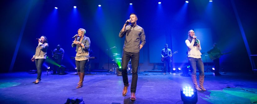
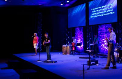
The top focus for me when designing a new set is to create something that has a good deal of versatility to it. There are some churches who have the staffing, budget and or creativity to change stage designs monthly or even weekly. I love these churches because they are not only being a creative force in their community but they continually create sets that provide me with inspiration for things that I in turn can adapt for my space. I can't copy what they are doing because my space, congregation, and limitations are going to be very different than theirs. I can however take a concept that someone else has used and adapt it in some way, shape or form to match my venue and congregation. Over the course of my time doing this, I have been fortunate to have the ability and budget to introduce new stage designs every two to 5 months, depending on the church and financial climate.
Flexibility!
When I create a set, I want to have something that will have flexibility over time so it does not become stale or boring and can be adapted somehow if it's going to be up for a while. I have had a number of sets where after a month or two of being up I can make some small adjustments to the set or the lighting of the set to refresh the look of the stage. Creating designs with some small lighting or set tweaks in mind can help you effectively keep he stage looking somewhat fresh even when you know you will not have the budget or time to introduce something brand new for a while.

Versatile Set Designs
A great way to keep your set design versatile is to almost always use white materials and then introduce the color with lighting using color washing fixtures such as LED or intelligent fixtures. I have found that using white material gives me the ability to change the look at least somewhat from song to song, service to service, or month to month, depending on how frequent you want to change. For the ultimate control and flexibility in color, I find white or even neutral colored material gives me the ability to adjust the color on the fly and get exactly what I'm looking for. A word of caution, some fabric colors will produce great results while others look terrible. You might also be limited in what colors you can produce with the fixtures and gels you have available to you. With white or neutral colored material this is not an issue.
Multiple Dimensions

The second focus for me when designing a set is to create multiple dimensions. Have you ever shone a light onto a flat surface? You get a flat looking, lighted object. Now add some texture, curves, bends or other dimensionality to the material and you get some areas lighted more than others. When you light from multiple angles with different colors you will see different areas enhance different colors and/or possibly get some color mixing. A 3D set gives you exponentially more interest in the way light can be used.
The Look and Feel of 3D
One of my favorite materials that I've ever used have been Wafer Wall panels from Atomic Design. They have a curve in them on both diagonals so if you light them from the top and bottom or the right and left with two different colors (i.e. blue from the bottom and green from the top) you will get areas that show blue, some that show green, and some that are blended. If you only light it from one direction you get some great looking shadows that accentuate the multiple dimensionality and that will look great too. You can make a flat surface look nice, but as the most recent film craze shows we love the look and feel of 3D. I'm always looking to add more dimensionality and depth to every design I create.
Wrapping it Up
Are there other thoughts and considerations when designing a space? Absolutely, but I find myself always coming back to the flexibility and dimensionality of the design. Unless you are fortunate enough to be able to change your design frequently, having something with flexibility and adaptability is key to keeping a design fresh over time. Regardless of the material, texture and arrangement of the design, having multiple dimensions will make a design pop in a way a 2D design never could. Keep these two focuses in mind when designing your next set and you might find you get a lot more bang for your buck.
Give us a call for great deals and inspiring ideas for your stage design!
(800) 562-6006